Tranquil
Tranquil is a minimalist, Muji-inspired timepiece designed with nearsighted individuals in mind. Unlike traditional clocks with small numbers that can become blurry at a distance, Tranquil features a large paper fan to show time.
Year:
2017
clock 1.0
A clock that clams and slows you down.
In this class, we studied Muji’s design language. Muji is a Japanese retail company, known for its minimalism and simplicity in design, with a no-logo or "no-brand" policy.
In the first half of the class, I designed a clock that represents Muji’s brand identity -- calmness and emptiness. By removing the stressful numbers from the clock and replacing it with an elegant paper fan, it reminds me of the peaceful moment I step into a Muji store.


design challenge
Continue on Clock 1.0, I need to design a Clock 2.0 focused on human-centered product innovation.
How can I improved on Clock 1.0?
What else can my fan clock provide?
What other features do people want in a clock?
exploration
Designing clocks for different environments, needs, and demographics.


I did some rough mockups and explored many basic forms because Muji is known for its minimal and simple design.
choosing a direction

I woke up one morning and realized I could see the fan clock without my glasses. I made a few more prototypes and find a few myopic friends to test. The result was good and everyone agrees that the fan clock provides a better and clearer visual representation of the time compared to normal clocks.
According to The National Institute of Health, “about 42% of Americans ages 12-54 are nearsighted”. From there, I decided to focus on designing a Clock 2.0 for people with nearsightedness.
Refined sketches
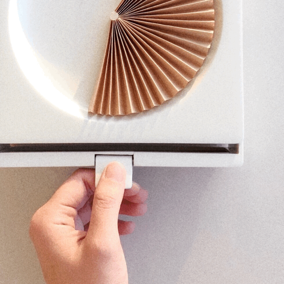
After some survey, I found that most nearsightedness people put on their glasses and check the time the moment they get out of bed. So I decided to add a glasses storage area near the clock.

refined mockups


On the Wall or on the Table?
I chose to do a the wall clock over the table clock because:
The wall clock adds a beautiful home decor to the room.
The table clock could clutter the nightstand.
The pull down motion adds a nice surprise element.
clock 2.0
A simple and clean fan clock for people with nearsightedness.


why this clock?

WHAT DO NEARSIGHTED PEOPLE SEE?
Both digital and analog clocks are hard to read. I designed a fan clock that covers a large area, so it’s easier to read even when it’s blurry.
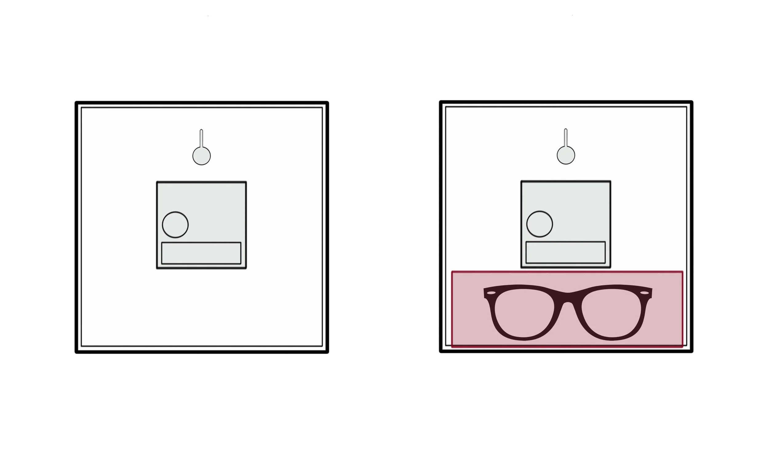
WHERE TO PLACE MY GLASSES?
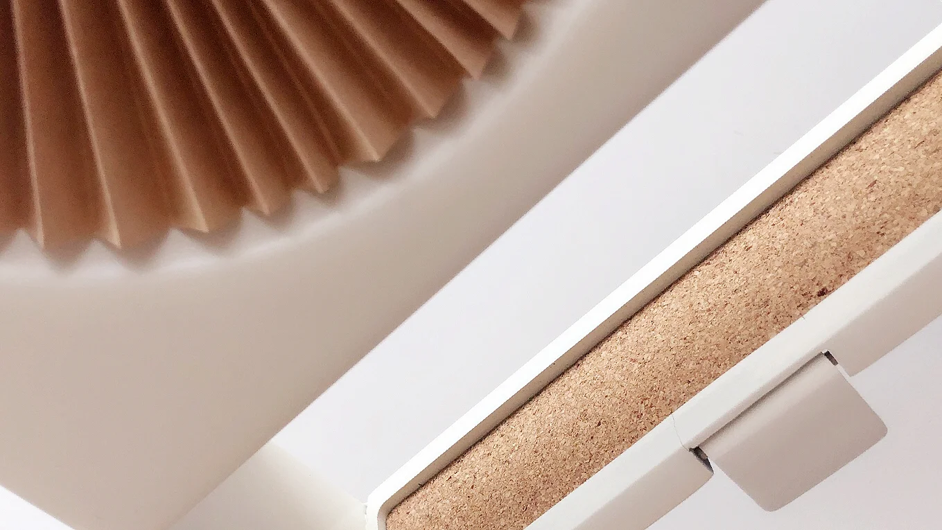
The back of a clock has a lot of free space that is not being utilized so I redesigned it into a glasses compartment.

DAY & NIGHT
Light strips are added to the clock to guide people to their glasses at night. So people don’t need to look for their glasses in the dark.
HOW TO TELL TIME ?

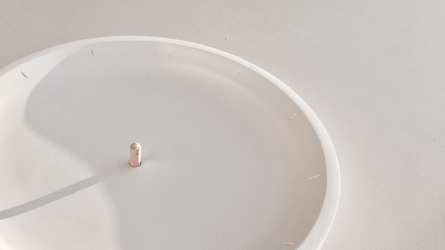
Hour: Clockwise starting point of fan
Minute: Area covered by fan
( Clock above shows 12:20 )
MORE PROJECTS: